
Thoughtfully crafted to keep the experience effortless, cohesive, and uniquely branded.
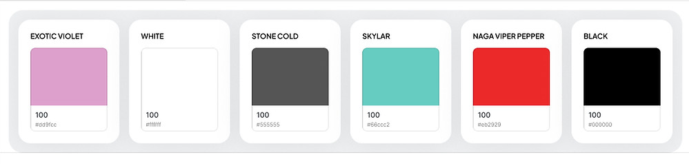
Color System
Balancing Flavor and Function
The color palette was built to reflect the brand’s bold personality while supporting intuitive interactions. Skylar serves as the anchor, a fresh and energetic tone that highlights key actions like placing an order or checking out. Naga Viper Pepper introduces urgency for alerts without overwhelming the interface, while Exotic Violet adds just the right pop for accent details. Supporting neutrals like Stone Cold and Black ensure text and UI elements maintain accessibility and contrast. These colors weren’t just picked for aesthetics, they were chosen to guide, delight, and communicate clearly.
Typography System
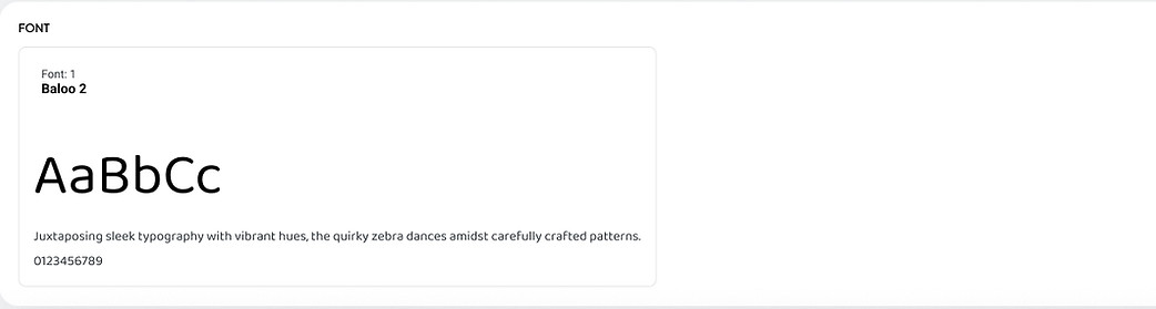
Setting the Tone with Baloo 2
Baloo 2 was chosen for its bold, rounded character and inviting personality. It captures the playful spirit of the food truck brand while remaining clean and readable on mobile screens. The typeface gives the app a friendly, energetic vibe that makes browsing the menu or tracking an order feel fun and approachable, never stiff or overly formal.
Button System
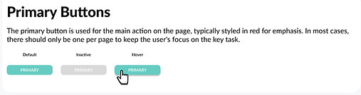

Driving Actions with Clarity and Confidence
Button styles were designed to communicate priority with intention. The primary button uses Skylar to draw attention to the most important actions, placing an order, confirming a pickup, so users never question where to tap next. The hover and inactive states provide helpful visual feedback, reinforcing user confidence. Secondary buttons were kept minimal with a black stroke to handle lower priority actions without competing for attention. This button system creates a clear interaction hierarchy that keeps the user journey focused and friction free.
Spacing System
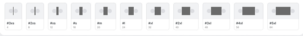
Creating Breathing Room and Visual Flow
Spacing is often invisible when done right, but it plays a critical role in the app’s usability. I created a modular spacing system that scales from tiny padding to generous margins, ensuring every element has room to breathe. It helps content feel digestible, buttons feel tappable, and screens feel organized without being overwhelming. Especially on mobile, spacing ensures clarity and focus, giving users a smooth, scrollable experience that flows naturally from one action to the next.