Transforming Patient Journeys, One Stress-Free Exit at a Time
Project Overview
Timeline
January 2023 - May 2023
Industry
Role
Healthtech
UI/UX Designer, UX Researcher
Tools
Figma, Illustrator, Zoom
Brief summary
This project focused on making healthcare management more accessible and user-friendly for patients.
Goal
The goal was to develop an efficient discharge process within the app to:
-
Reduce patient wait times
-
Provide real-time tracking of discharge paperwork
-
Make it easy for patients to access & download documents
Experience An Effortless Discharge Process with Our Innovative App Feature. Fast, Stress Free, and Always at Your Fingertips!
The Challenge & Solution
Challenge
Long Wait Times:
Users complained about extended wait times when accessing healthcare facilities through the health care app, leading to frustration and inconvenience.
Slow Processes:
The app's existing processes for getting in and out of healthcare facilities were perceived as slow and cumbersome, causing dissatisfaction among users.
Anxiety-Inducing and Stressful Processes:
Existing procedures for getting in and out of healthcare facilities, especially the discharge process, were causing stress and anxiety among users. The complexities and uncertainties surrounding these procedures added to the emotional burden of patients.
Solution
Efficient Discharge Process:
Develop a user-friendly and efficient discharge process through the healthcare app to reduce anxiety and stress levels among patients.
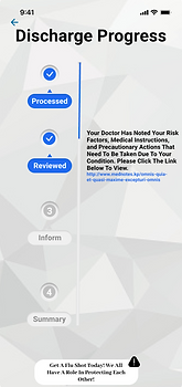
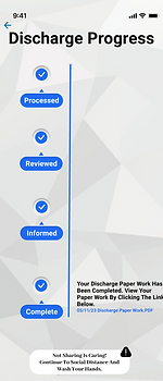
Real Time Progress Updates:
Provide live updates on the progress of a user's discharge paperwork, allowing them to track the process and alleviate uncertainty.
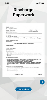
Easy Access to Discharge Documents:
Users should be able to view, download, and access PDF copies of their discharge paperwork seamlessly once the process is complete.
Benefitting Users and Staff:
Aim to improve the overall quality of life for both patients and healthcare staff by making processes more efficient, user-friendly, and less stressful.
Research Process
Methods
Secondary Research:
Found that streamlining the discharge process reduces stress & improves patient satisfaction.
Methods
Secondary Research:
Found that streamlining the discharge process reduces stress & improves patient satisfaction.
Competitive Analysis:
Studied apps from Mayo Clinic & Cleveland Clinic, emphasizing their focus on patient-centered UX.
User Interview:Conducted interviews to uncover pain points & frustrations, which informed our design solutions.
Key Insights:
-
Patients wanted to stay informed but struggled with slow, stressful processes.
-
Information overload was a major issue—users preferred clear, step-by-step updates instead of walls of text.
-
Real-time visibility of their discharge status significantly reduced patient stress.
Persona & Journey Mapping
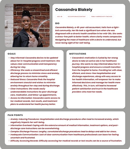
User Persona:
Created “Cassandra,” representing a typical patient dealing with discharge frustrations.
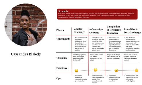
Journey Map:
Showed high stress levels due to prolonged discharge processes & unclear information.
User Persona
Journey Map
Design Approach
Focus
The main goal was to simplify the discharge process and ensure patients could easily track paperwork & access medical records.
Ideation Phase:
-
Mapped task flows for key actions like requesting discharge & tracking progress.
-
Prioritized critical features (e.g., discharge tracking, document access, real-time updates).
-
Used Crazy 8’s to explore UI variations for the new discharge experience.
Design Process:
-
WCAG-Compliant Design System with accessible contrast, readable typography, and large tap targets.
-
Wireframes optimized for usability, ensuring critical information is upfront.
-
Prototyped live tracking screens to visually show the discharge process in
-
real-time.
Design System:
To enhance the Kaiser app's brand identity and establish a more distinct presence,
I refined the existing brand identity elements. This redesign aimed to preserve the core essence of the current brand while giving it a refined and recognizable touch within the healthcare sector. To maintain a professional and cohesive appearance, a comprehensive design system and style guide were meticulously developed.

Illustrations
Typeface Hierarchy

Icon Library

Outcome
Results & Impact
-
During usability testing users reported less stress & confusion about discharge timelines.
-
Simplified document retrieval improves usability & reduced calls to staff.
-
A more patient friendly, accessible app that prioritized clarity & ease of use.
What I Learned
-
Accessibility matters: Patients needed clear visual cues & real-time updates to feel in control.
-
Simplification = Better UX: Breaking down complex processes into easy, guided steps made a huge impact.
-
User research drives meaningful solutions: The biggest wins came from listening to patient frustrations & iterating based on real feedback.