
Navigating the Future of Aviation Technology with Elegance and Innovation.
Project Overview
Timeline
May 2023 - Aug 2023
Industry
Fleet management
Role
UI/UX Designer, UX Researcher
Tools
Figma, Zoom
Brief summary
SkyIT is an aviation solutions provider offering specialized services to a technical client base. The existing website lacked clear information hierarchy and intuitive navigation, making it difficult for users to locate key services efficiently.
Goal
-
Create a modern, intuitive website with a clean information architecture.
-
Improve navigation and user experience to make content more accessible.
-
Enhance the brand’s digital identity to align with its innovative vision.
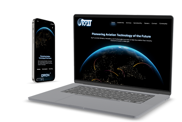
Forging the Future of Aviation Management Technology
The Challenge & Solution
Challenge
Unclear Information Hierarchy:
Users struggled to locate key services due to disorganized content structure and weak visual prioritization.
Navigation Friction:
Primary actions and service pathways were not clearly defined, increasing cognitive load and reducing task efficiency.
Outdated Structure:
The legacy layout did not support scalable content expansion, limiting future growth and adaptability.
Solution
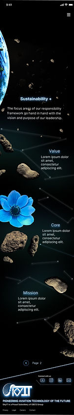
Improved Information Architecture for Seamless Navigation
Restructured the site map to simplify content organization and reduce clutter.
Simplified UX Flow with Clear Navigation Paths
Refined navigation and UX flow, reducing user friction and improving task completion rates.
A Modernized, High Tech Visual Identity
Developed a sleek, professional aesthetic that aligns with SkyIT’s brand values.
Research Process
Methods
Secondary Research: Understanding the Need for Change:
SkyIT’s past design updates fell short, outdated visuals and structure limited impact. Stakeholders sought a sleek, future ready look that reflected innovation and supported growth.
Competitive Analysis & Stakeholder Insights:
Industry research revealed inconsistent UX patterns, from clean, intuitive sites to cluttered, hard to navigate designs. Stakeholder interviews helped clarify business goals and user priorities, guiding the redesign toward clarity, cohesion, and a stronger reflection of SkyIT’s innovation.
Key Insights:
-
User feedback indicated difficulty locating priority services, prompting a restructuring of the main navigation and content grouping.
Competitors with modern, engaging designs had better user retention and engagement.
-
Analysis showed competitors with clearer hierarchy and focused layouts encouraged deeper engagement, influencing layout simplification.
-
Discussions revealed the need for a scalable structure capable of supporting future service expansion.
User Pain Point Map
SkyIT’s site suffered from cluttered navigation, dense content, and weak hierarchy that made information hard to find. Outdated visuals and poor branding failed to reflect its innovation, while small text, broken buttons, and poor mobile support frustrated users. A clear, modern redesign was needed to restore usability and trust.
User Pain Point Map

Design Approach
Focus
Improve usability and engagement while elevating SkyIT’s digital presence.
Information Architecture Restructure:
-
Reorganized services into clearer categories to reduce cognitive load and improve discoverability.
Hierarchy & Visual Priority:
-
Established consistent heading patterns and spacing systems to guide user attention toward primary actions.
Scalable Layout Framework:
-
Designed modular sections that allow additional services to be integrated without disrupting structure.


Outcome
Results & Impact
-
The restructured information architecture was designed to improve service discoverability and reduce navigation friction.
-
Clearer hierarchy and prioritization aimed to increase user engagement by making key services easier to locate.
-
The scalable layout framework positioned the site to support future service expansion without structural redesign.
-
If implemented with analytics tracking, expected performance indicators would include improved time on page, reduced bounce rates, and increased service page interaction.
What I Learned
-
Clear information hierarchy directly impacts user confidence and exploration behavior.
-
Early stakeholder alignment ensures product decisions support long term business goals.
-
Designing scalable systems prevents future structural rework.
-
Modernization is most effective when paired with structural clarity, not just visual updates.
.png)