
Where usability meets identity, each element crafted to do more with less.
Color System

Vibrant, Clear, and Trustworthy
Hublink’s palette blends personality with clarity. Bold purples like Cosmic Sunset and Pisces Vivid Lilac bring energy and identity, while a wide range of grays adds balance and structure. Accent tones like Jittery Jade and Red Red guide users with visual cues for action and alerts. The system ensures high contrast, accessibility, and a polished feel across every screen.
Typography System
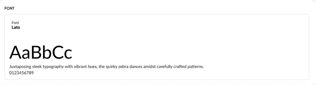
Functional Simplicity with a Unified Voice
Hublink uses the Lato typeface for its clean, modern, and highly legible structure, perfect for a platform built on clarity and accessibility. By leveraging multiple weights and sizes, from Extra Bold for titles to Regular and Medium for body content. The design system ensures strong hierarchy and seamless readability across devices. These consistent type treatments help guide users intuitively through each stage of their journey, without distraction or visual clutter.
Button System
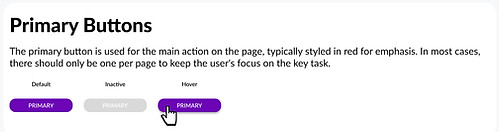
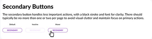
Intentional States for Clear Action
Hublink’s button system is built to guide users with clarity and intention. The primary button, styled in bold purple, drives focus to the most important action on each screen. Its hover state subtly intensifies color to encourage clicks, while the inactive state dims to signal unavailability without confusion.
The secondary button supports less critical actions, using outlined styles with thoughtful restraint. Its hover and inactive states maintain consistency without competing for attention, ensuring that primary CTAs always lead.
Spacing System
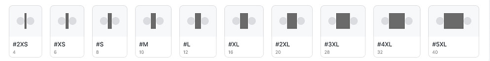
Structured Breathing Room
Hublink’s spacing scale ensures balance, rhythm, and visual harmony across all screens. With clearly labeled increments from 2XS to 5XL, the system allows for consistent padding, margin, and layout spacing, making content easier to scan and interact with. This modular approach keeps the interface feeling clean and breathable, especially as users move between public and tenant specific views.